
Honolulu Restaurant Reservation App
Personal UX/UI Case Study
Project Overview
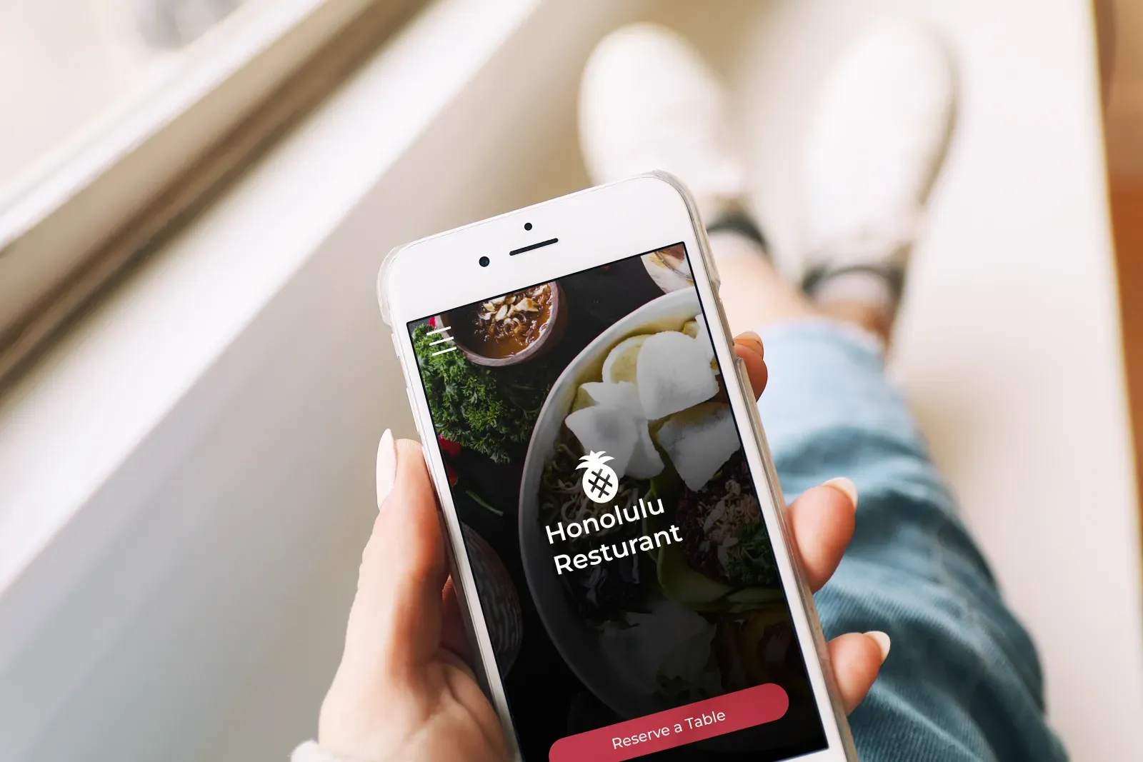
Honolulu is my personal UX/UI case study for a restaurant reservation app. I explored how people could plan a meal or book an event through a clearer mobile experience. The restaurant is the setting for the design study, not a commercial client app or a verified operating business.
The Problem
The design problem was how to make dining and event reservations easier to navigate.
The goal
My goal was to design an app where people could choose a dining reservation or an event and understand the steps to confirm it.
Project Details
Date:
2022
Client:
Personal Project
Services:
UX/ UI Design
My Contributions
I worked through the UX design from the first ideas to the final prototype: interviews, paper and digital wireframes, low- and high-fidelity prototypes, usability studies, accessibility considerations, and design revisions.
Platforms
Figma
User Research:
Summary
May 2022
I used interviews and empathy maps to understand the people I was designing for. The research focused on busy working adults planning family time. It suggested that limited time was only part of the problem: other responsibilities and the feeling of not spending enough time together also shaped their needs. These findings belong to this design study, rather than a claim about every family.
Persona 1: Mary Lou
Problem Statement:
Mary Lou is the study’s persona: a busy HR director who needs a straightforward way to reserve a family dinner.
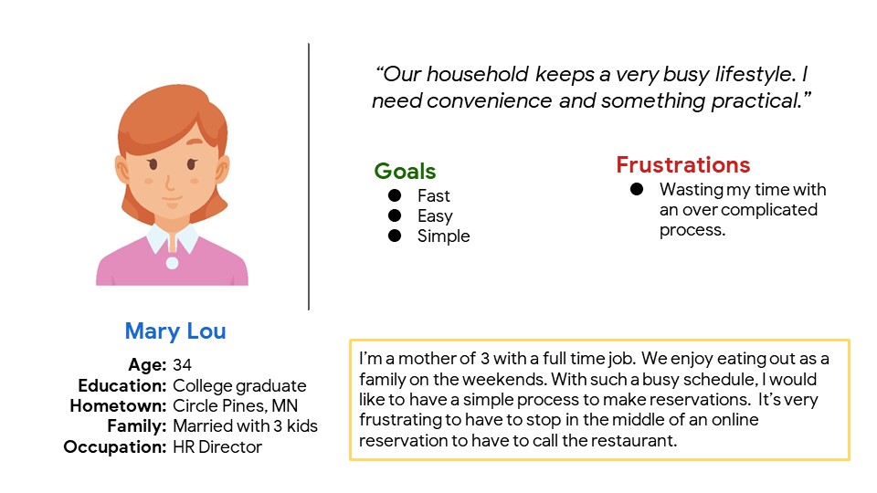
Read Mary Lou’s persona details
Persona used in this personal case study.
“Our household keeps a very busy lifestyle. I need convenience and something practical.”
- Age
- 34
- Education
- College graduate
- Hometown
- Circle Pines, MN
- Family
- Married with 3 kids
- Occupation
- HR Director
Goals: fast, easy and simple.
Frustration: wasting time with an overcomplicated process.
“I’m a mother of 3 with a full time job. We enjoy eating out as a family on the weekends. With such a busy schedule, I would like to have a simple process to make reservations. It’s very frustrating to have to stop in the middle of an online reservation to have to call the restaurant.”
User Journey Map
Problem Statement:
Mapping Mary Lou’s journey helped me identify opportunities to show event information earlier and reduce repeated entry with autofill.
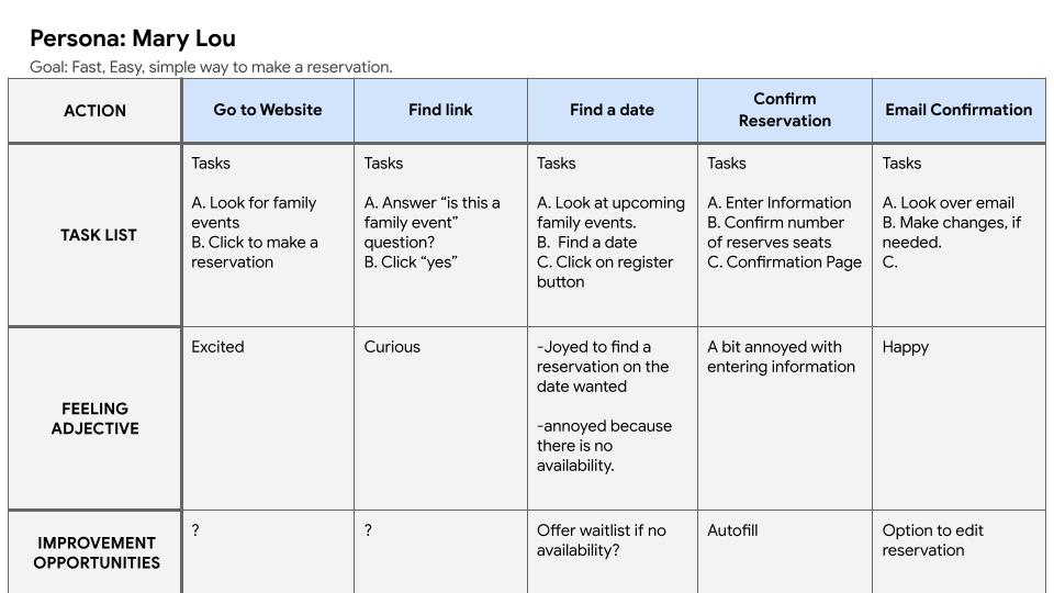
Read the user journey map
Persona: Mary Lou. Goal: a fast, easy, simple way to make a reservation.
- Go to Website. Look for family events and click to make a reservation. Feeling: excited. Improvement opportunity: not specified in the map.
- Find link. Answer “is this a family event?” and click “yes.” Feeling: curious. Improvement opportunity: not specified.
- Find a date. Look at upcoming family events, find a date, and click the register button. Feelings: joy when the desired date is available; annoyance when it is not. Opportunity: offer a waitlist if there is no availability.
- Confirm Reservation. Enter information, confirm the number of reserved seats, and reach a confirmation page. Feeling: a bit annoyed with entering information. Opportunity: autofill.
- Email Confirmation. Review the email and make changes if needed. Feeling: happy. Opportunity: an option to edit the reservation.
Digital Wireframes
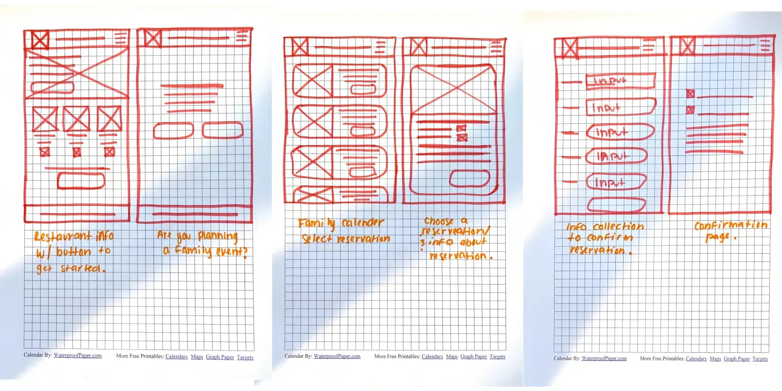
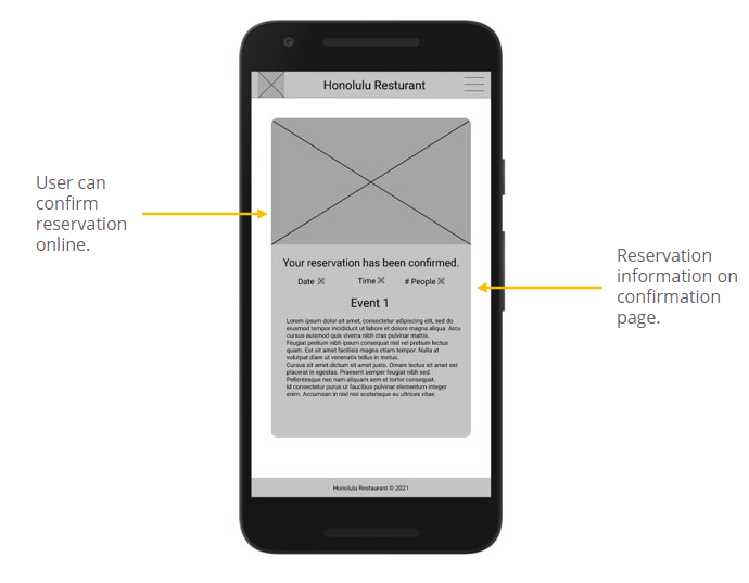
I kept the wireframes simple while making space for the information people need before reserving.
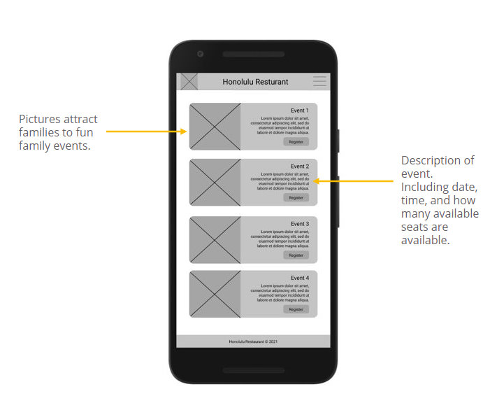
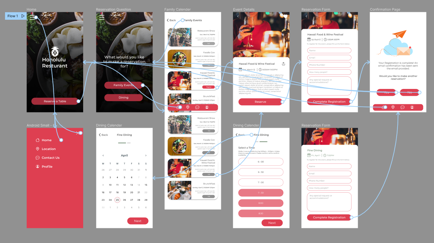
I wanted people to be able to confirm a reservation in the app without needing to call the restaurant.
Low-Fidelity Prototype
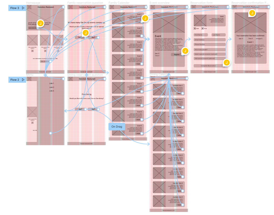
I connected the early screens into a simple prototype for choosing a date and making a reservation. This gave me a way to test the flow before refining the visual details.
Usability Study: Findings
I conducted a usability study with three participants, recorded their actions, and grouped observations in an affinity map to look for common themes.
Round 1 Findings
1. Users need a clear icon to represent a date.
2. Missing information left participants needing clearer cues.
3. Participants needed a clearer explanation of when a reservation was confirmed.
Round 2 Findings
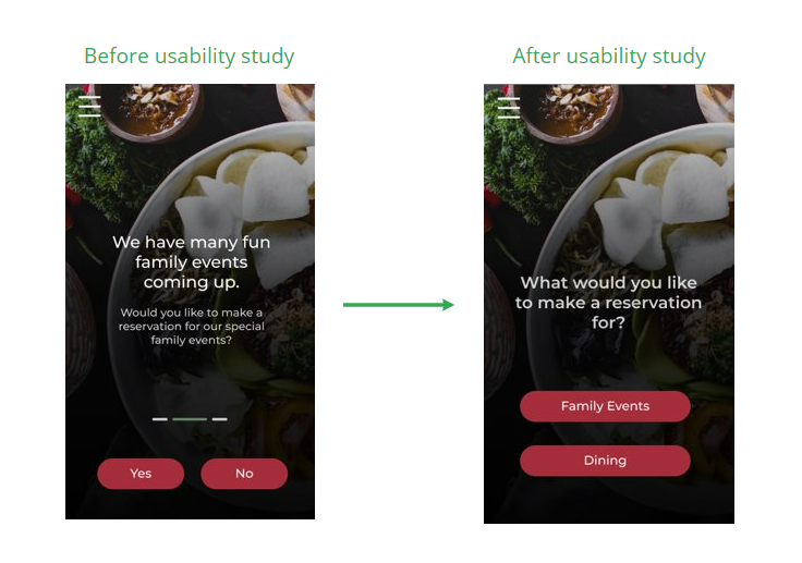
1. Users needed a better way to make a reservation for dining vs events.
2. Users felt stuck or the process felt incomplete when making it to the confirmation page.
3. Some visual elements were difficult for participants to notice or reach.
Mockups
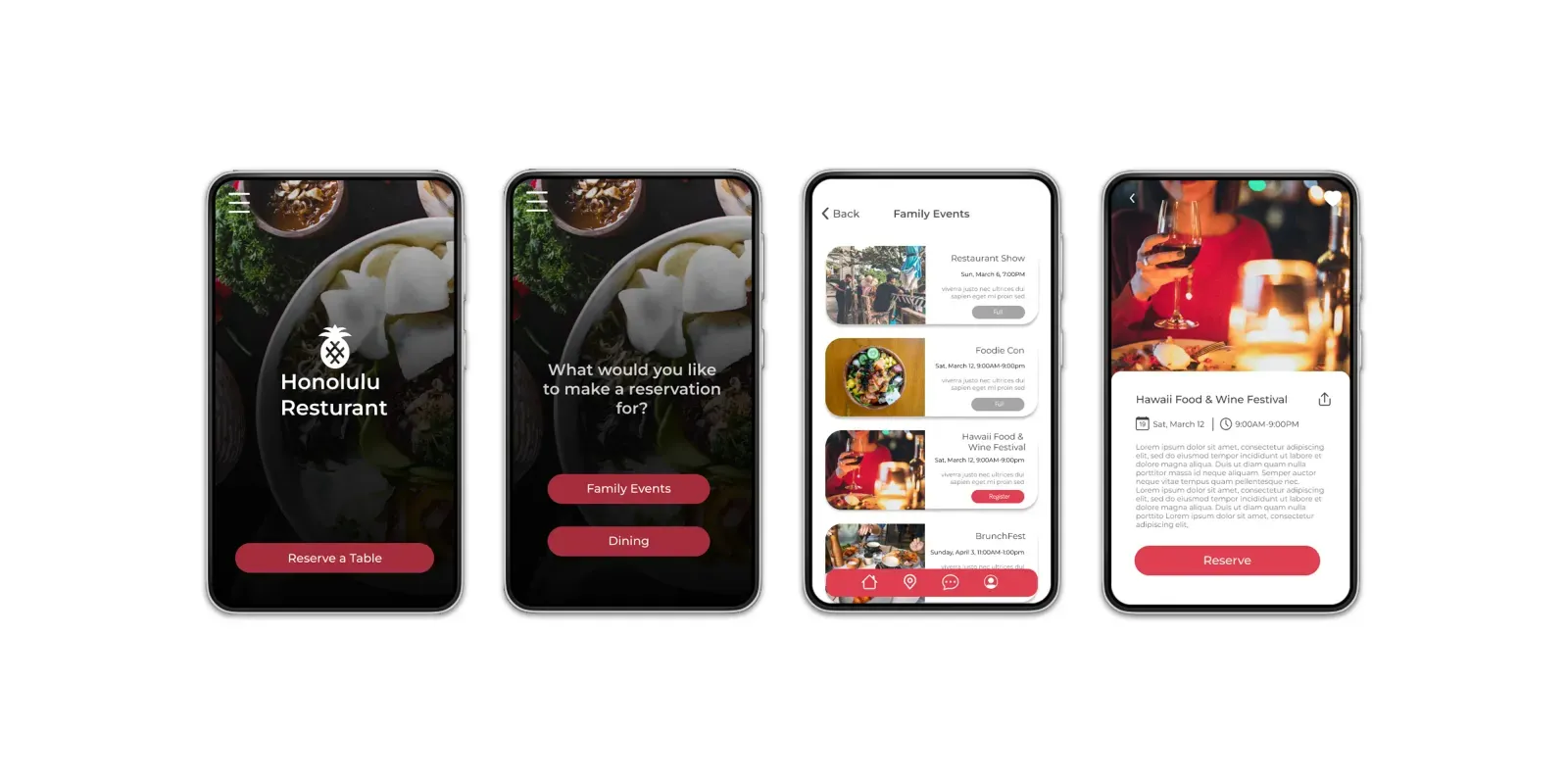
The early flow used a yes-or-no question followed by another screen, which caused confusion in the study. I combined the screens and clarified the question so the process was easier to follow.
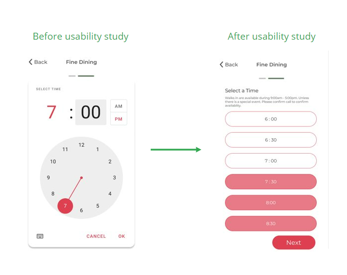
I revised the time-selection screen to show which reservation times were no longer available, giving people more context before they chose.
High-Fidelity Prototype
I kept the main reservation flow in the high-fidelity prototype and incorporated changes from the usability study. You can explore the revised design using the prototype link below.
Accessibility Considerations
1. I considered color contrast and used color carefully to support readability.
2. I considered timing in the prototype, keeping interactions within five seconds. This choice alone does not establish accessibility compliance.
3. I included a menu to offer another way to navigate the prototype.
Next Steps
1. I would run another usability study to look for remaining points of confusion.
2. I would use further research to guide the next round of improvements.
Takeaways
Impact:
The concept is intended to make reservations easier to understand. It has not been launched as a commercial app, so I’m not claiming measured booking or business results.
What I learned:
I learned how much I can miss when I design only from my own perspective. Testing and feedback helped me see where the first version was unclear and gave me a better direction for the next one.
Want to work together?
Thinking about improving your existing website? Explore my website redesign services, or tell me about the project you have in mind.